In the fast-paced realm of digital marketing, the marketing funnel guides us towards successful customer engagement.
At (un)Common Logic, we’ve come to appreciate that each stage of this funnel presents unique opportunities to connect and convert. Central to leveraging these opportunities are landing pages tailored for each funnel stage. Let’s dive into how to create effective landing pages, backed by statistics and real-world examples.
- Awareness Stage – Sparking Interest
At this stage, the aim is to capture attention, specifically from first time users who came in from a very broad channel (display, video, social, or very high funnel search).
Statistics show that users form an opinion about a website in just 0.05 seconds. A landing page at this stage must be visually striking and informative without overwhelming the visitor.
At this stage, the business goal is to illustrate why your content is relevant to the user and what problem or questions it might solve for them. Don’t overly focus on your brand and product yet.
A blog post or a white-paper are typically great examples of landing places for the awareness stage.
Design and Content Tips:
– Educational Content: Offer high-quality content like eBooks, whitepapers, or informative videos that address general topics related to your industry.
– SEO Optimization: Use relevant keywords to improve search engine visibility.
– Minimalist Design: Keep the design simple and distraction-free, focusing on the content.
- Interest Stage – Nurture Curiosity
For B2B, 47% of buyers viewed 3-5 pieces of content before engaging with a sales rep (Demand Gen Report).
This stage’s landing page typically comes from users who are looking for solutions to their pain points and seeking to be educated on a topic.
Users in this stage are coming in from search as well as through targeted efforts (email lists, retargeting high funnel, defined display, and social audiences).
The landing pages in this case should provide more specific information to nurture this curiosity.
HubSpot’s resource page offers in-depth guides and reports, effectively nurturing potential leads.
Design and Content Tips:
– Detailed Guides and Case Studies: Offer more in-depth content that showcases your knowledge and experience.
– Visual Storytelling: Use infographics or videos to present information in an engaging way.
– Social Proof: Include customer testimonials or case studies to build credibility.
- Consideration Stage – Deepen the Connection
According to Marketo, companies that excel at lead nurturing generate 50% more sales-ready leads at a 33% lower cost.
At this stage, the users are well aware of their pain and are looking for the best available means to solve it. As expected from this stage, users will be heavy search users (including digital search, offline and online word of mouth, and influencer opinion).
Landing pages here should compare and position the business offering as the best solution (price, service, terms, shipping, etc..). Additionally, landing pages should contain high quality testimonials (preferably videos), ratings from third party sources, and high quality interactive product images, videos, or demos.
For example, we helped our B2B SaaS client increase their homepage conversion rate 550% by redesigning their homepage. Check out the details here!
Design and Content Tips:
– Strong Call-to-Action: Use compelling and clear CTAs like “Start Your Free Trial” or “Get Started Today”.
– Urgency and Scarcity: Incorporate elements of urgency, like limited-time offers or countdown timers.
– Reassurance: Include guarantees, return policies, or user support options to alleviate any last-minute hesitations.
- Intent Stage: Encourage decision
Forrester reports that a well-designed user interface could raise your website’s conversion rate by up to 200%. This stage’s landing page should make purchasing as easy as possible.
When users are ready to make a decision, the landing page has to help reduce as much friction as possible and help the user complete the action.
The users at this stage have completed their research. They have almost chosen the business to go with after visiting the site several times and examining the different options. The landing page needs to avoid confusion and should not add more options or information that encourages further thinking. At this stage, the page should be especially compelling and action-oriented.
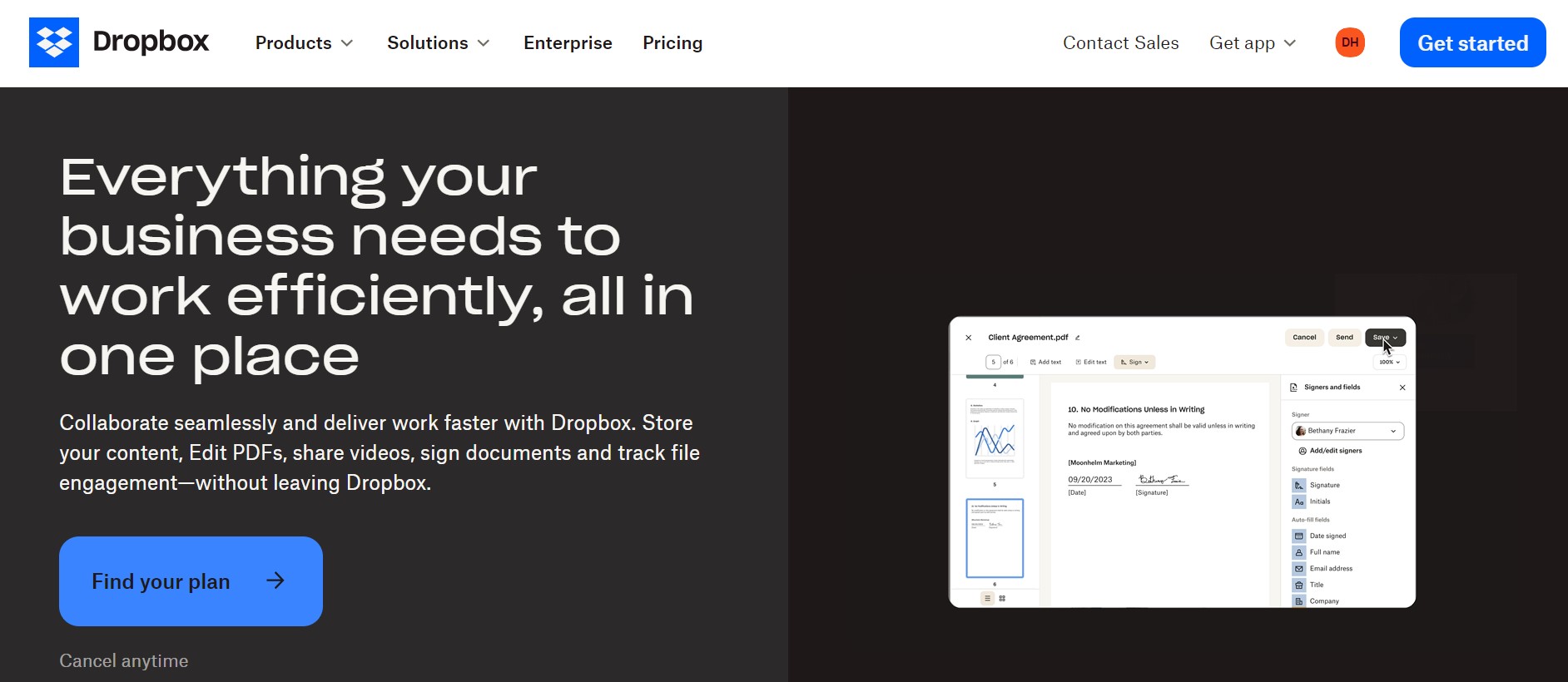
Dropbox Business uses strong CTAs and clear value propositions to turn interest into action.
Design and Content Tips:
– Simplified Forms: Ensure the checkout or sign-up process is straightforward and user-friendly.
– Clear Pricing Information: Display pricing clearly and transparently.
– Trust Signals: Include security badges or encryption information to build trust in the transaction process.
- Loyalty Stage: Building a relationship
Most businesses focus their efforts on landing pages for new customers. It makes sense, they cost the most; however, as we discussed in previous blogs on CLTV, increasing the CLTV on customers that already know and love your brand will result in higher ROI. According to a study by Yotpo, 37% of customers will spend more on a brand they are loyal to.
These customers are usually driven by remarketing and email efforts; therefore, the goal of the business is to focus on customer satisfaction, improve retention, and reward loyalty. And the landing page urging the user to sign-up for the loyalty program needs to show them exactly what they would get when signing up (e.g. exclusive and customized coupons).
Microsoft’s x-box landing page calls their loyalty program members “ambassadors,” because they know a loyalty program is a short step away from the final state of the funnel. 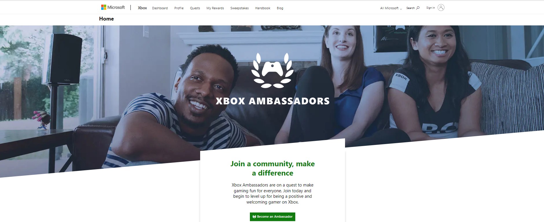
Design and Content Tips:
– Feedback Requests: Invite customers to provide feedback or participate in surveys.
– Exclusive Offers: Provide special deals or early access to new products.
– Community Building: Encourage joining a community or forum related to your product.
- Advocacy Stage: Turning a customer to a spokesperson
The final stage’s landing page should encourage sharing and referrals. Nielsen reports that 92% of consumers believe recommendations from friends and family over all forms of advertising.
Some businesses have a referral program, but in this day and age, a brand needs to better leverage their best customers and turn them into advocates on their site and on social. Similar to the loyalty program, the landing page needs to be clear on defining what’s in it for the user who creates content (a video, written, or image) that advocates for the business.
Additionally, the landing page should be paired with other testimonials of people who shared their advocacy and an example of other posts.
Design and Content Tips:
– Referral Programs: Introduce programs that reward customers for referrals.
– Social Sharing Options: Make it easy for customers to share their experiences on social media.
– Highlight User-Generated Content: Showcase customer reviews, testimonials, or user-generated content.
Crafting landing pages for each funnel stage is not just about reaching audiences; it’s about strategically moving them towards conversion. At (un)Common Logic, we understand that the effectiveness of digital marketing lies in creating tailored experiences at each funnel step. Remember, the journey doesn’t stop at conversion; it’s about creating a cycle of engagement, loyalty, and advocacy.
By integrating these insights into our strategy, we’re not just guiding potential customers through their journey – we’re accompanying them and providing value at every turn.
Want to learn more? Check out how to master Meta ads or how PPC has evolved into what it is today.
Contact us to talk about your digital marketing challenges and learn more about our full-funnel, data-driven approach!