We at (un)Common Logic often say there is no one “hack” or “magic trick” for digital marketing success. But that’s not quite true. There is a process which positively impacts digital marketing efforts, and that process is Conversion Rate Optimization (CRO). What is CRO and how does it work? Briefly, CRO is figuring out what makes a website user more likely to complete a desired action and implementing changes accordingly. This process includes:
- Using data to identify current friction points throughout the user journey
- Leveraging UX best practices to develop hypotheses to reduce the friction
- Testing the hypotheses against the current experience to determine which performs greater
- Implementing changes from the tests that had positive results
- Conducting ongoing, iterative testing
Read on for more details about CRO and how it works as applied to one of our clients.
What is (un)Common Conversion Rate Optimization (CRO)?
At (un)Common Logic, conversion rate optimization is the process of removing user friction on a website, resulting in more users completing the desired conversion action (call us, sign up to subscribe to a newsletter, make a purchase, etc). Implementing CRO boosts all digital performance, from organic search to paid media to social. To do it well, we apply data and best practices but for us, CRO isn’t just A/B testing, it’s about where the data and strategy indicate testing would be beneficial. By placing a priority on data and strategy first, we are able to identify hypotheses that can have greater impact and also have a higher likelihood of success. Our current test win rate across all CRO engagements is 61%…but even when a test is proven “wrong,” we gain valuable insights. By improving the user experience, you can directly impact your site’s conversion rates. This positive impact leads directly to other key business initiatives like lowering customer acquisition cost and profitably widening your marketing net.
Sounds good, right? But how does it work? Let’s take a look at how we applied CRO to a long-term client.
A Real-World Example of How We Apply CRO
This particular client is a mature company in a mature industry. The business sells both products and services in three dozen locations, many of them in smaller cities and towns, across one state. A website conversion can be making a service appointment or selecting products to purchase. Customers are often purchasing in the moment, which means reaching them at the right place and time is very important and making it easy to purchase is critical. The owners were skeptical about the benefits of CRO so they agreed to an incremental implementation.
First Steps: The Homepage
Since the face of the site is the home page and the first thing a visitor sees is usually the website header on the site’s homepage, the header and homepage content need to be clear, concise, and easy to read and understand from a user standpoint. The website header should be sized not to interfere with content and include the logo, call-to-action (CTA), headline, navigational elements, and search bar. Color choices and contrast, font, white space, and the flow from one element to another all effect readability; for example, font best practices include using only 2-3 variants per page for cohesion.
From any business’ perspective, the homepage should drive users toward the desired conversion action in an intuitive way. That means one primary, distinctive call-to-action clearly visible above the fold, with any secondary CTAs either below the fold or reduced in size or location.
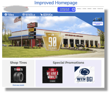
While this business’ original homepage included an appropriately sized header with the main elements included, the rest of the homepage was visually cluttered and included competing CTAs and offers. This type of layout contained too many choices for a user, resulting in reduced engagement and conversion rates. Additionally, the original design meant that a user saw only the option to set an appointment to purchase products, not to set an appointment for services or take advantage of special promotions.
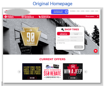
By applying spatial best practices directed at user engagement to the homepage, focusing the user on the desired conversion, and using ongoing data-driven A/B testing, we were able to deliver an 83% increase in appointment requests and a 190% decrease in bounce rate in less than 60 days (length of time to achieve results is partially dependent upon the volume of traffic).
Next: Improving the Mobile Experience
In today’s mobile-first world, the majority (60% or more, depending on which study you look at) of user searches take place on our phones. Because of that, even for high-dollar purchases and long-sales-cycle services, the mobile user experience is important to every business. The price point and usual purchase situations for the customers of this client mean that it’s even more likely that a user will be searching for their product or service with a mobile phone.
Many websites rely on the traditional responsive website design to port their desktop version to mobile directly, without considering differences in readability and usability on that smaller screen. Font size, density of copy, menu items and placement, and the CTA all affect the user experience and conversion rate on mobile. Responsive mobile design is focused on adjusting experience to screen size primarily. Additional considerations around messaging and usability for mobile devices is often missing. Mobile phone users have an expectation for ease of use and navigation as they engage with a site; by matching the mobile experience to those expectations, a business will see higher engagement rates and lower bounce rates.
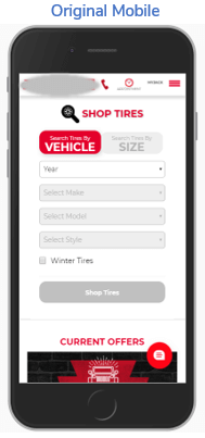
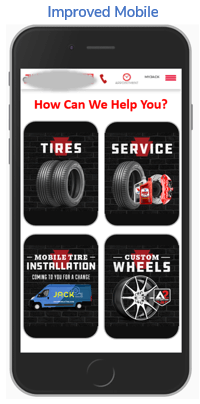
For this client, we modified the mobile version of their site so that it would include tiles featuring the main user options and a welcoming “How can we help you?” header to make the mobile site look more like an app. These changes, as well as moving “current offers” below the fold, resulted in a 15.5% increase in conversion rate and an 8.4% decrease in exit rate.
What Next? Making Purchasing Easier
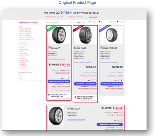
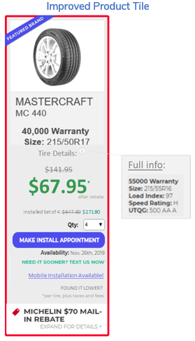
The third area of CRO focus was improving the purchasing experience. To increase the likelihood of a purchase, the product pages should include essential information like price and options above the fold, with the rest of the page for details like technical specifications or reviews. By simplifying the product page layout and highlighting desired actions, conversion rates increase.
This client’s pages for product selection were visually cluttered with details and added unnecessary friction with many difficult-to-read elements.
Simplifying the product tile and emphasizing information valuable to shoppers resulted in a 56% increase in user engagement.
By thinking about how we can reduce friction throughout the user journey (whether on desktop or mobile), using data and best practices to develop hypotheses to test, implementing the changes that demonstrate improvements, and conducting ongoing, iterative testing, any website can experience dramatic improvements to their digital performance.
Contact us to learn more about the (un)Common Logic approach to using data to refine and improve your digital marketing conversion rates to achieve your business goals.
- Using data to identify current friction points throughout the user journey
- Leveraging UX best practices to develop hypotheses to reduce the friction
- Testing the hypotheses against the current experience to determine which performs greater
- Implementing changes from the tests that had positive results
- Conducting ongoing, iterative testing
What is (un)Common Conversion Rate Optimization (CRO)?
At (un)Common Logic, conversion rate optimization is the process of removing user friction on a website, resulting in more users completing the desired conversion action (call us, sign up to subscribe to a newsletter, make a purchase, etc). Implementing CRO boosts all digital performance, from organic search to paid media to social. To do it well, we apply data and best practices but for us, CRO isn’t just A/B testing, it’s about where the data and strategy indicate testing would be beneficial. By placing a priority on data and strategy first, we are able to identify hypotheses that can have greater impact and also have a higher likelihood of success. Our current test win rate across all CRO engagements is 61%…but even when a test is proven “wrong,” we gain valuable insights. By improving the user experience, you can directly impact your site’s conversion rates. This positive impact leads directly to other key business initiatives like lowering customer acquisition cost and profitably widening your marketing net. Sounds good, right? But how does it work? Let’s take a look at how we applied CRO to a long-term client.A Real-World Example of How We Apply CRO
This particular client is a mature company in a mature industry. The business sells both products and services in three dozen locations, many of them in smaller cities and towns, across one state. A website conversion can be making a service appointment or selecting products to purchase. Customers are often purchasing in the moment, which means reaching them at the right place and time is very important and making it easy to purchase is critical. The owners were skeptical about the benefits of CRO so they agreed to an incremental implementation.First Steps: The Homepage
Since the face of the site is the home page and the first thing a visitor sees is usually the website header on the site’s homepage, the header and homepage content need to be clear, concise, and easy to read and understand from a user standpoint. The website header should be sized not to interfere with content and include the logo, call-to-action (CTA), headline, navigational elements, and search bar. Color choices and contrast, font, white space, and the flow from one element to another all effect readability; for example, font best practices include using only 2-3 variants per page for cohesion. From any business’ perspective, the homepage should drive users toward the desired conversion action in an intuitive way. That means one primary, distinctive call-to-action clearly visible above the fold, with any secondary CTAs either below the fold or reduced in size or location. While this business’ original homepage included an appropriately sized header with the main elements included, the rest of the homepage was visually cluttered and included competing CTAs and offers. This type of layout contained too many choices for a user, resulting in reduced engagement and conversion rates. Additionally, the original design meant that a user saw only the option to set an appointment to purchase products, not to set an appointment for services or take advantage of special promotions.
By applying spatial best practices directed at user engagement to the homepage, focusing the user on the desired conversion, and using ongoing data-driven A/B testing, we were able to deliver an 83% increase in appointment requests and a 190% decrease in bounce rate in less than 60 days (length of time to achieve results is partially dependent upon the volume of traffic).
Next: Improving the Mobile Experience
In today’s mobile-first world, the majority (60% or more, depending on which study you look at) of user searches take place on our phones. Because of that, even for high-dollar purchases and long-sales-cycle services, the mobile user experience is important to every business. The price point and usual purchase situations for the customers of this client mean that it’s even more likely that a user will be searching for their product or service with a mobile phone. Many websites rely on the traditional responsive website design to port their desktop version to mobile directly, without considering differences in readability and usability on that smaller screen. Font size, density of copy, menu items and placement, and the CTA all affect the user experience and conversion rate on mobile. Responsive mobile design is focused on adjusting experience to screen size primarily. Additional considerations around messaging and usability for mobile devices is often missing. Mobile phone users have an expectation for ease of use and navigation as they engage with a site; by matching the mobile experience to those expectations, a business will see higher engagement rates and lower bounce rates.
For this client, we modified the mobile version of their site so that it would include tiles featuring the main user options and a welcoming “How can we help you?” header to make the mobile site look more like an app. These changes, as well as moving “current offers” below the fold, resulted in a 15.5% increase in conversion rate and an 8.4% decrease in exit rate.
What Next? Making Purchasing Easier
The third area of CRO focus was improving the purchasing experience. To increase the likelihood of a purchase, the product pages should include essential information like price and options above the fold, with the rest of the page for details like technical specifications or reviews. By simplifying the product page layout and highlighting desired actions, conversion rates increase. This client’s pages for product selection were visually cluttered with details and added unnecessary friction with many difficult-to-read elements.
Simplifying the product tile and emphasizing information valuable to shoppers resulted in a 56% increase in user engagement.
By thinking about how we can reduce friction throughout the user journey (whether on desktop or mobile), using data and best practices to develop hypotheses to test, implementing the changes that demonstrate improvements, and conducting ongoing, iterative testing, any website can experience dramatic improvements to their digital performance.
Contact us to learn more about the (un)Common Logic approach to using data to refine and improve your digital marketing conversion rates to achieve your business goals.